Card (ALPHA)
Responsive Widgets are in alpha and available by invitation only on Business and Enterprise plans. Behavior and properties may change. To request access, open a support ticket and name the feature Responsive Widgets (ALPHA).
The Card widget is a container. You drop other widgets into its body. It can also show an image at the top, a header row with an avatar, title, and subtitle, and a footer with up to two action buttons. Use it to group content about one item, such as a customer, product, or task.
A new Card starts with every extra part turned off. It is just a surface with an empty body. Turn on the parts you need in the property pane.
Widget type: WDS_CARD_WIDGET
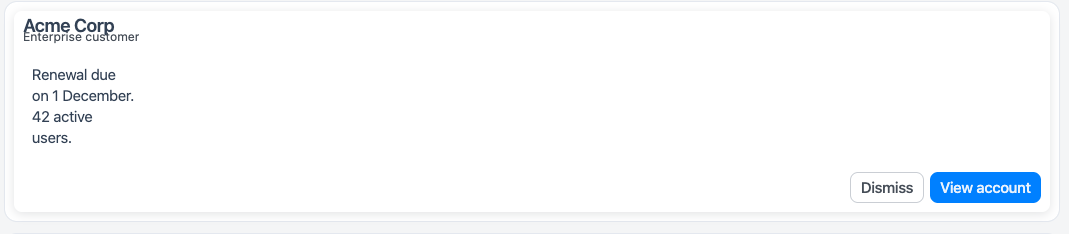
Card layout
From top to bottom, a card shows:
- Media header: an image band. Shows when Show media header is on.
- Header row: avatar, title, and subtitle. Shows when Show header is on.
- Body: the widgets you drop into the card.
- Footer: the secondary and primary action buttons. Shows when Show footer is on and at least one action has a label.
If you delete the card's body from the entity explorer, the editor shows "This card's body was deleted. Undo to restore it." Use undo to bring it back.
Image URLs
The media image and the avatar image use the same URL checks as the Image widget. They allow:
- URLs on the same origin as your app, including relative paths.
- Absolute
https:URLs on any domain. - Base64 raster data URLs in this exact form:
data:image/<type>;base64,<data>, where<type>ispng,jpeg,jpg,gif,webp,avif, orbmp. The URL can be up to 4 MB long.
They reject http: URLs on another domain, SVG and other data URLs, javascript:, blob:, other schemes, and protocol-relative values such as //example.com/a.png. Images load with referrerPolicy="no-referrer".
Content properties
These properties appear in the Content tab of the property pane.
Media
Show media header boolean
Shows an image band above the card content. Default: off.
Image string
Sets the URL of the media image. Shows when Show media header is on. See Image URLs. If the URL is empty, rejected, or fails to load, the band shows the Alt text, or "No image" if alt text is empty.
Alt text string
Sets the text that screen readers read for the media image. The empty band also shows this text. Shows when Show media header is on.
Header
Show header boolean
Shows the avatar, title, and subtitle row above the body. Default: off.
Title string
Sets the card title. Long titles are cut to one line. Shows when Show header is on. Default: Card title.
Subtitle string
Sets a line of supporting text under the title. Long text is cut to one line. Shows when Show header is on.
Show avatar boolean
Shows an avatar at the start of the header row. Shows when Show header is on. Default: off.
The avatar shows the image first. If there is no image, or the image is rejected or fails to load, it shows initials. If there is no label for initials, it shows an icon.
Avatar image string
Sets the URL of the avatar image. See Image URLs. Shows when Show header and Show avatar are on.
Avatar label string
Sets the avatar's accessible name and the source of its initials. If empty, the avatar uses the title. Shows when Show header and Show avatar are on.
Footer
Show footer boolean
Shows the footer action row below the body. Default: off.
Primary action label string
Sets the label of the primary button. This is a filled button that comes after the secondary button. Leave it empty to hide the button. Shows when Show footer is on. Default: Confirm.
Secondary action label string
Sets the label of the secondary button. This is an outlined button that comes before the primary button. Leave it empty to hide the button. Shows when Show footer is on.
General
Visible boolean
Controls whether the widget is visible. Default: on.
Loading boolean
Shows a skeleton over the card while on. The card content stays in place under the skeleton, so the widgets inside keep their state. While loading, clicking the card does nothing. Default: off.
The card also shows the skeleton on its own while a query it depends on is running.
Example:
{{Query1.isLoading}}
Animate loading boolean
Controls the loading animation of the widget. Default: on.
Events
See Events.
Style properties
These properties appear in the Style tab of the property pane.
General
Variant string
Sets the look of the card surface. Options:
- Elevated (default): a raised surface with a shadow.
- Filled: a tinted surface with no border or shadow.
- Outlined: a surface with a thin border.
Values for code: elevated, filled, outlined.
Custom styling
These settings are in the Custom styling section, at the end of the Style tab. An empty setting uses the theme value. For theme colors, dark mode, and the rules for custom CSS, see Custom styling.
Accent color string
Builds the hover, pressed, focus, and text colors of this widget from one color, in light and dark mode. Lists and menus that the widget opens use them too. Empty means the theme accent.
Background string
Sets the background of the widget surface. Takes a theme color, a custom color, or a gradient.
Text color string
Sets the text color of the widget surface. Takes a theme color or a custom color. When it is empty and Background is set, the widget picks a readable text color.
Border color string
Sets the border color of the widget surface. Takes a theme color or a custom color. A color with no Border width draws a thin border.
Border width string
Sets the border width of the widget surface. Options: From theme (default), None, Thin, Medium, Thick. You cannot bind this property.
Corners string
Sets the corner radius of the widget surface. Options: From theme (default), Sharp, Rounded, Pill. You cannot bind this property.
Custom CSS string
Adds plain CSS to this widget. Rules apply only inside the widget, and & is the widget surface. You cannot bind this property.
Reference properties
Reference properties let you read the widget's state in bindings and code, for example {{Card1.isVisible}}. You cannot set them directly.
isVisible boolean
Shows whether the widget is visible.
Example:
{{Card1.isVisible}}
title string
Holds the card title.
Example:
{{Card1.title}}
subtitle string
Holds the card subtitle.
Example:
{{Card1.subtitle}}
variant string
Holds the card variant: elevated, filled, or outlined.
Example:
{{Card1.variant}}
showSkeleton boolean
Shows whether the Loading setting is on.
Example:
{{Card1.showSkeleton}}
Methods
Methods let you change the widget's properties from code, for example in a JS Object.
setVisibility (param: boolean): Promise
Shows or hides the widget.
Example:
Card1.setVisibility(false)
setLoading (param: boolean): Promise
Shows or hides the loading skeleton. This method sets Loading.
Example:
Card1.setLoading(true)
Events
onClick
Runs when users click the card surface. Clicks on buttons, links, inputs, and other interactive widgets inside the card do not run it. Keyboard and screen reader users can trigger it with a hidden button at the start of the card. That button is named after the card title, or the widget name if the title is empty.
onPrimaryClick
Runs when users click the primary footer button. Shows when Show footer is on.
onSecondaryClick
Runs when users click the secondary footer button. Shows when Show footer is on.